Borrowell Concept Car
Driving a design vision through a conceptual lens
Case Study
Background
Founded in December 2014, Borrowell has helped over 2.5 million Canadians access their credit score for free. In addition to credit score monitoring, members are shown financial products they qualify for and their likelihood of approval.
Shortly after I joined, Borrowell made the jump to becoming a multi-product company by adding two new offerings:
Credit Builder, an instalment loan product designed to help improve credit history.
Rent Advantage, which provides a way for renters to have their rent payments count towards their credit score.
I was the Senior Design Director at Borrowell from May 2022 - May 2023, and provided ongoing design coaching and consulting afterwards. My responsibilities included hiring and managing a team of five (a mix of product design, visual design, and research), implementing new design processes, updating design systems, working with cross-functional peers, and some individual contributor work as needed.
Problem
Transitioning from a single-product offering to a multi-product offering is a difficult challenge. From messaging to onboarding to information architecture, it's not easy to integrate two new products into an existing platform. In addition, there were a number of issues with the existing product that needed to be addressed as well; specifically onboarding, churn, and branding).
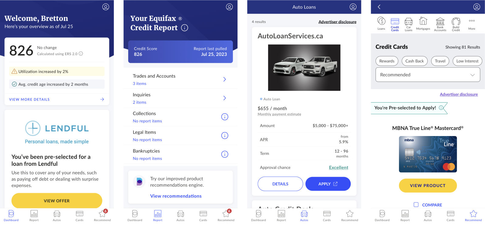
Screenshots of the original Borrowell app for reference
For our end-of-year on-site meeting, the executive team asked me to present a design vision to all of the company leaders.
Goals
I wanted to address a variety of problems in this presentation:
Primary: Core product onboarding had a 46% drop-off rate. The process was lengthy, and included some challenging steps for identity verification. The two new product offerings each had their own funnel which was only accessible internally, and had drop-off rates in excess of 80%. Adding these to the end of the core product onboarding flow was going to significantly increase the complexity.
Secondary: Newly onboarded members had a 40% churn rate. The core value proposition of the product is to help people improve their credit score so they’re eligible for better financial products. However, the primary product messaging was focused solely on getting a free credit score. As a result, many people just received their free credit score and left.
Tertiary: The brand itself was overdue for a visual refresh. A stronger visual identity would not only help marketing and retention efforts, but it would also improve the overall sense of trust. Trust is incredibly important given the sensitive nature of financial products.
Initial Process
I chose to present this design vision in the form of a “concept car” prototype. Just like a real concept car, the goal is to explore new ideas in a way that triggers the imagination and gets people excited. This was one of the first presentations of our week-long leadership meeting, so it had to really set the tone and provide a useful anchor point for the breakout ideation sessions that followed.
Unlike speculative design work, which often lacks context around business goals and constraints, this work was informed by my time working internally at Borrowell. Through the regular course of running the design team I was exposed to a wide array of quantitative and qualitative data points, from conversion funnels and per-project data dashboards to customer support feedback and interviews. The job of a designer involves immersing yourself in as much information as possible, then continuously synthesizing that along with the business objectives to shape and test new ideas.
Research
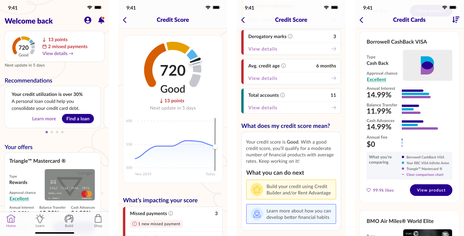
To address the primary problem of onboarding drop-off, I looked at our funnel data and found that most drop-off happened near the end of the flow, at the identity verification step. For the two new credit building products, their drop-off was also at the end of their respective flows, but in their case at the bank connection and payment steps.
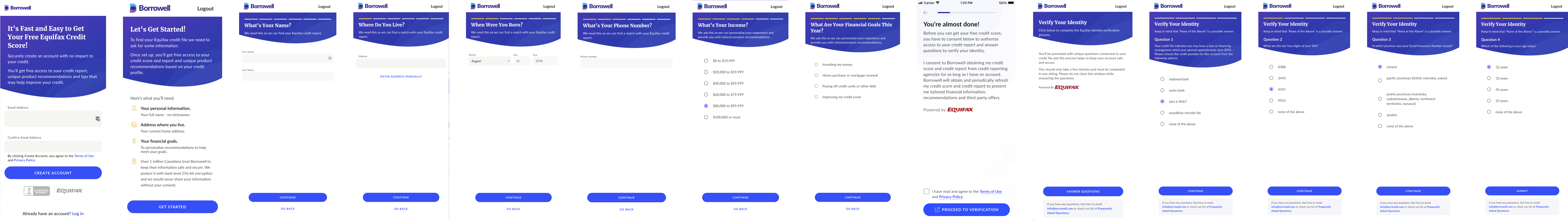
Borrowell's original onboarding flow (don't worry about the specifics, the point here is to show that it's long
To address the churn rate, I looked at qualitative data like surveys, reviews, customer support feedback, interviews, and more. Quantitative data can tell you something is happening, but qualitative data can tell you why. After reading enough feedback, it became clear that members were only focused on getting a free credit score, and didn’t see the value in using that information to look for better financial products. It wasn’t hard to understand why: all the primary messaging on Borrowell.com refers to getting a free credit score — you have to scroll and read further to learn about the personalized financial product recommendations.
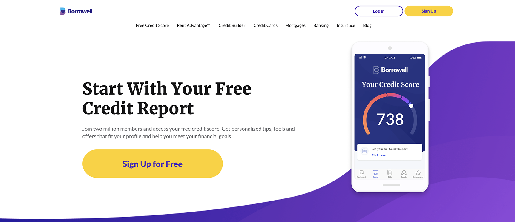
Borrowell's homepage (primary messaging only mentions getting a free credit score)
On the branding side, research involved looking at all of the other major players in our space to ensure that our new brand was distinctive and unique. I ran a quick exercise within the design team to look at each of our competitors and classify them by four major “brand types” (cute, simple, fancy, techie). We then talked about what our idealized brand would look like (primarily simple, secondarily cute, avoiding fancy or techie).
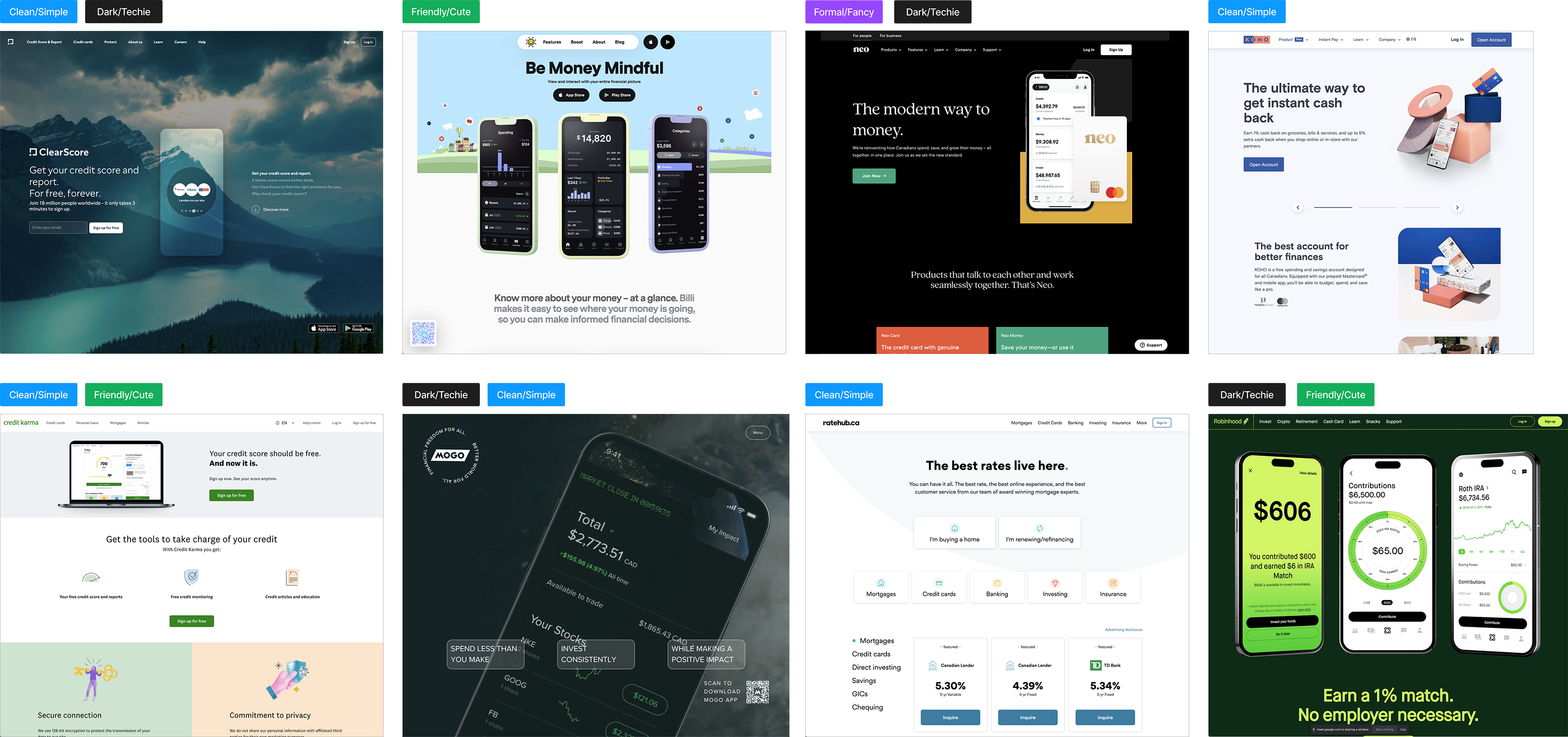
Brands in our competitive landscape, categorized as Clean/Simple, Friendly/Cute, Formal/Fancy, or Dark/Techie.
Approach
Onboarding
From my experience, the best onboarding is no onboarding at all. My initial approach was to simply let people in, demonstrate value, and give a la carte access to onboard to whatever product they want.
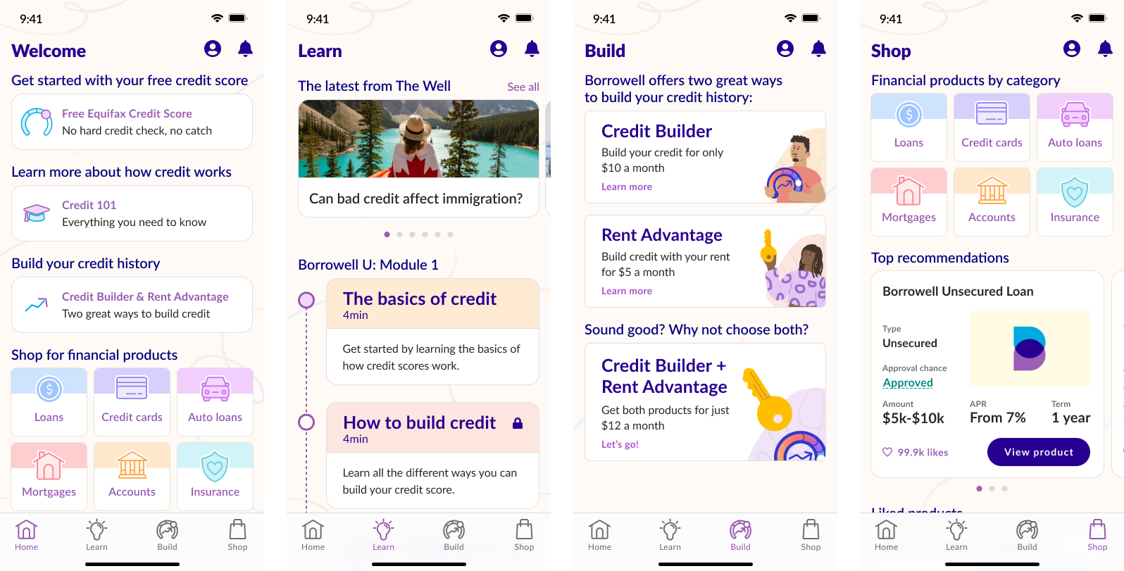
Concept Car mockups for a new "pre-member" experience
After talking about this approach with cross-functional peers, I realized that there were a few risks with this idea. From the perspective of our affiliate partners, our marketing team, as well as our support team, it was important that we had at least an authenticated email for all our members, even this new class of “pre-member” I was proposing. I looked at some other approaches and decided that Slack’s “magic link” had the lowest amount of friction and could increase overall security. People are generally bad at creating secure passwords, so with a magic link system we’d be able to strengthen their security profile without making people come up with and remember long passwords.
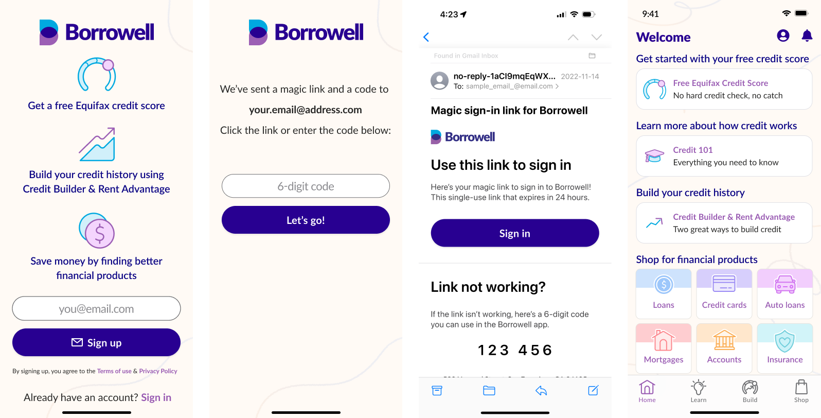
Updated sign up flow using just email and a magic link
Churn
In terms of addressing the churn rate, my first move was to update the initial messaging to better capture “the loop” of what Borrowell offers (see leftmost screen above). The 2 credit building products aren’t standalone offerings, they’re a key middle piece of the puzzle between getting a free credit score and finding better financial products. By telling people the complete story of what Borrowell offers in a simple way, the goal is to reframe how new users think about Borrowell.
The next way I chose to address churn was to focus on financial education. Research showed that the majority of Borrowell’s members didn’t fully understand how credit scores worked, why they’re important, and how to improve them. By introducing a new Learn section and repurposing existing blog articles into a “Borrowell U” format, the idea was to increase both trust and awareness. Trust is critical to any fintech product, especially one like Borrowell that involves connecting bank information.
Improving financial awareness ultimately benefits Borrowell because a better informed member base will be more likely to see the value of monitoring their credit score on an ongoing basis. Statistically, people who monitor their credit score are more likely to see improvements, which then gives Borrowell an opportunity to promote better financial products. By not forcing a lengthy onboarding and providing education up front, this would also have a positive effect on onboarding.
Branding
My team had already started building a foundation for a new friendlier brand identity, but it was only being used in external marketing/social materials. None of this work had yet made its way into the product or its landing pages, so this concept car was an opportunity to show what that could look like. Establishing a strong differentiated brand identity in a consistent way across all channels is yet another important way of building trust.
New friendlier brand elements rolled out on marketing channels, but not yet in the product
The goal of this new brand was to shift away from the generic blues and greys used in the current product to a warmer and friendlier tone. In addition to the UI updates, this also included updates to the copy — both the language used as well as migrating from title case to sentence case. The subtle use of textured elements was also a way of humanizing the brand; in other words, it’s ok to have small imperfections because nobody is perfect. Finances are one of the things people stress about the most, so the goal with this brand was to be an antidote to that.
New branding integrated throughout the product
Results
The goal of this prototype was to show all of the company leaders “what could be”, and to provide a useful anchor point for the rest of the week’s discussions. In that sense, the concept car was a complete success. Each of our breakout groups frequently referenced ideas from the concept car, and several ideas made their way onto future product roadmaps. In our post-session survey, 82% of respondents rated my concept car talk a 5 out of 5, with the balance giving it a 4 out of 5.
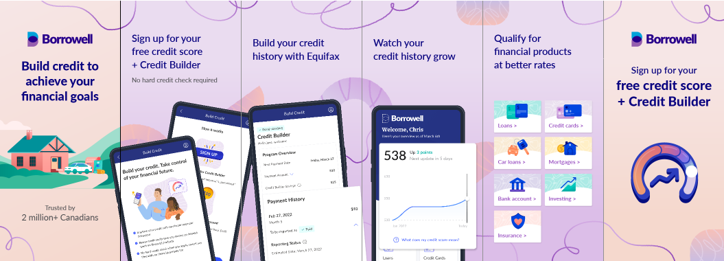
Early in my career I was skeptical about the value of creating concept car designs, but as long as they’re rooted in research and business context, I’ve found them to be a very useful tool for internal discussion. There are a lot of other fun little changes in here beyond the scope of this case study, such as a dedicated notification center and making the shopping experience more personalized and fun.
Click here to try the prototype out for yourself. Note: tap Home on the tab bar to toggle the logged in & logged out states