500px Portfolios
A case study demonstrating how 500px Portfolios were ideated, researched, and created
Case Study
Background
500px is a platform for the best professional photographers in the world to get exposure, inspiration, and monetization for their work.
Founded in October 2009, the company has experimented with a variety of monetization strategies and seen a lot of changes in leadership over the years. The company was acquired in 2018, and monetizes through a combination of photo licensing and paid memberships.
I was Design Director at 500px from March 2019 - May 2021.
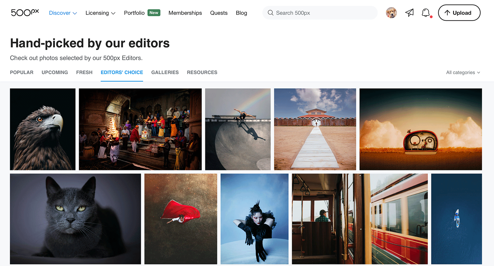
If you're looking for a daily dose of the best photography in the world, 500px is the place to go.
Problem
500px offers 3 membership tiers: Free, Awesome, and Pro. While most people use the Free plan, the $4.99/month Awesome plan was quite popular because it provided unlimited uploads and access to statistics.
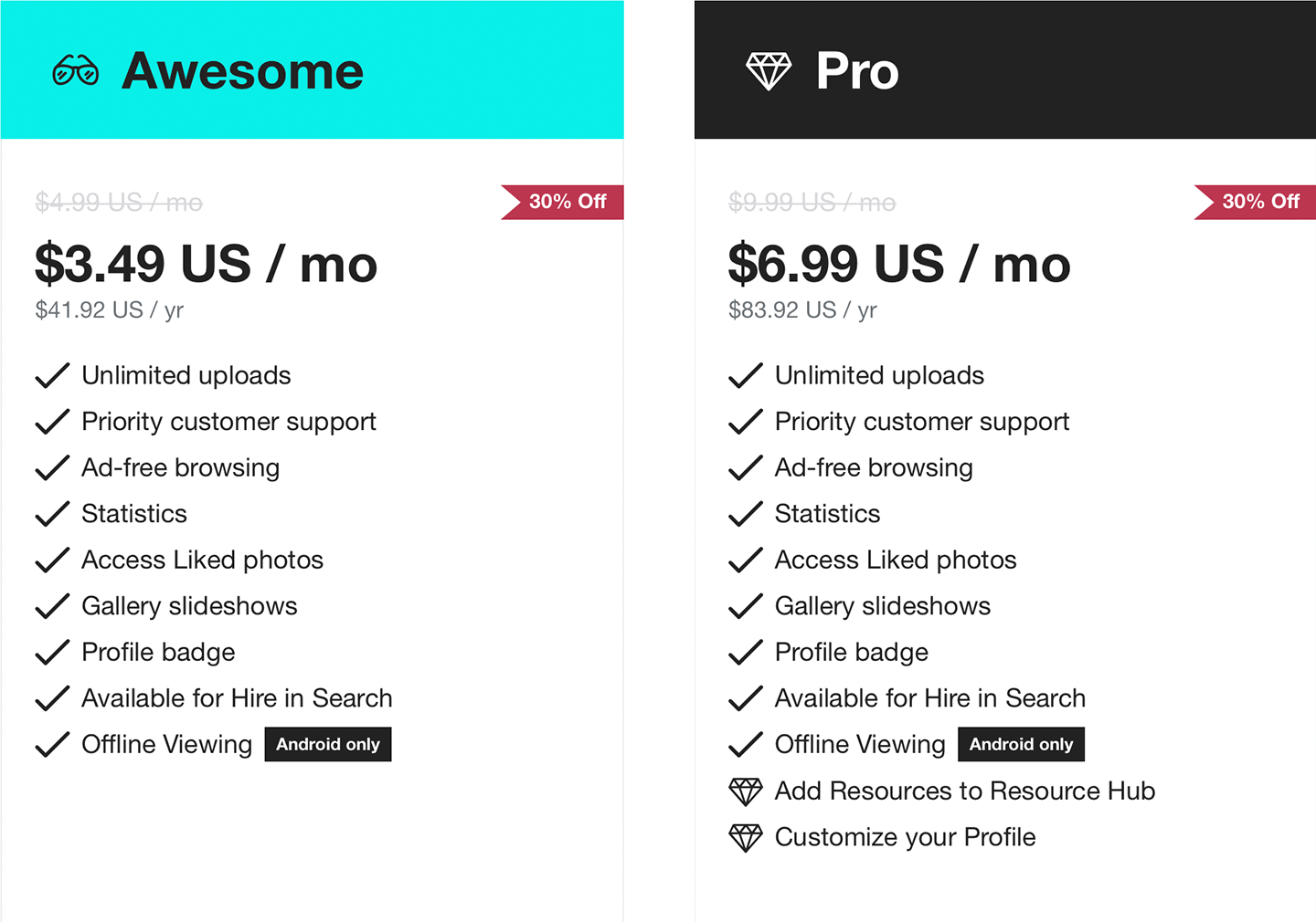
Some context on what each paid plan offered.
Unfortunately, despite being a platform for professionals, the Pro offering wasn’t selling very well. It wasn’t hard to see why: the extra value-add features weren’t being used. Our research found that many photographers were only buying the plan so it said “Pro” under their names instead of “Awesome”.
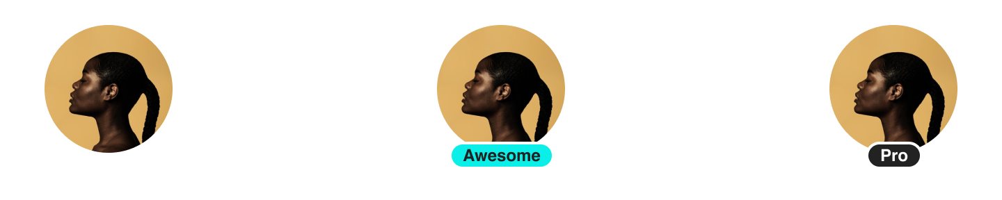
What avatars look like for Free, Awesome, and Pro members, respectively.
Superficial benefits like this are known as a “vanity features”, and in some products they’re a perfectly fine way to make money (see: Fortnite). However, despite years of experimenting with price points, the Pro plan just wasn’t valuable enough to professional photographers.
Goals
Primary: Increase Pro membership sales by providing more value.
Secondary: Leverage our platform’s existing strengths (stay in our wheelhouse).
Initial Process
Although “increase the Pro plan value” seems like too generic of a goal, in my opinion it’s exactly the kind of problem that should be given to a design team to solve. Too often, designers are given solutions to implement without any context about the actual problem to be solved.
As Design Director, it’s my job to use a combination of intuition and data in situations like these. I’ve always rejected the concept of “data-driven design”. Data should absolutely INFORM your design, but data itself can’t make decisions for you.
We had a few theories about how we could beef up the Pro plan and provide more value to professional photographers, so our first step was to try validating some of those ideas with qualitative and quantitative data.
Research
One of the more interesting ideas we pursued was around portfolios. Quantitative data analysis showed that over 85% of professional photographers had a portfolio URL in their profiles. To get a better sense of the landscape, our team spent a couple days checking out those URL’s, and some common themes began to emerge.
It’s clear that many of these portfolios were created in the early days of the web before responsive design was even a consideration. Most didn’t work at all on mobile browsers, which now form the majority of all web traffic*.
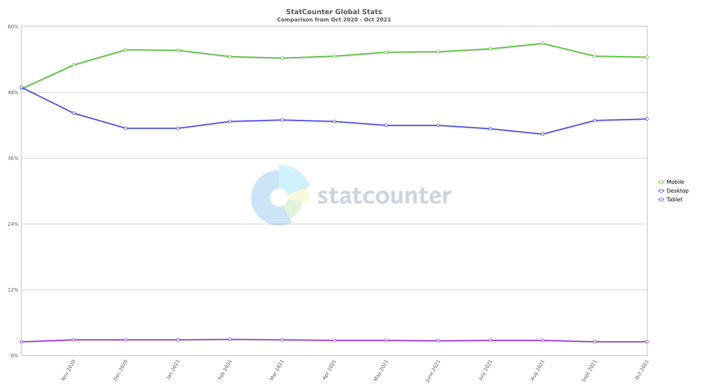
*Source: StatCounter Global Stats
We expected to see a lot of Webflow & Squarespace sites, and while there were some out there, they were few and far between. This was the type of puzzle that could only be solved through qualitative data (that is, talking to our customers).
Using the famous “Nielsen number”, we spoke to five Pro members and five photographers who weren’t on 500px.
We wanted to be careful not to bias the whole conversation toward our portfolios idea, so the first half of the interviews consisted of more general questions about people’s workflows, pain points in their lives, etc. Even without any direct prompts, portfolios were coming up quite often.
In the second half we asked more pointed questions about people’s portfolios - including our biggest burning question of why they weren’t using Squarespace or other website creators. The number one reason turned out to be around complexity.
As it turns out, the technical expertise of most pro photographers is specifically limited to photography tools. When it comes to the web, even tools that we considered simple were still too confusing to set up and update.
This was a breakthrough moment for us - not only did it validate our assumptions around the value of a portfolio product, but it helped shape our approach to building it.
Approach
Armed with this quantitative and qualitative data, our primary focus was to create the simplest onboarding flow possible - no more than 3 steps. We also made sure that the process of adding new content was built into the existing upload flow, and that removing content was built into the existing photo management tools.
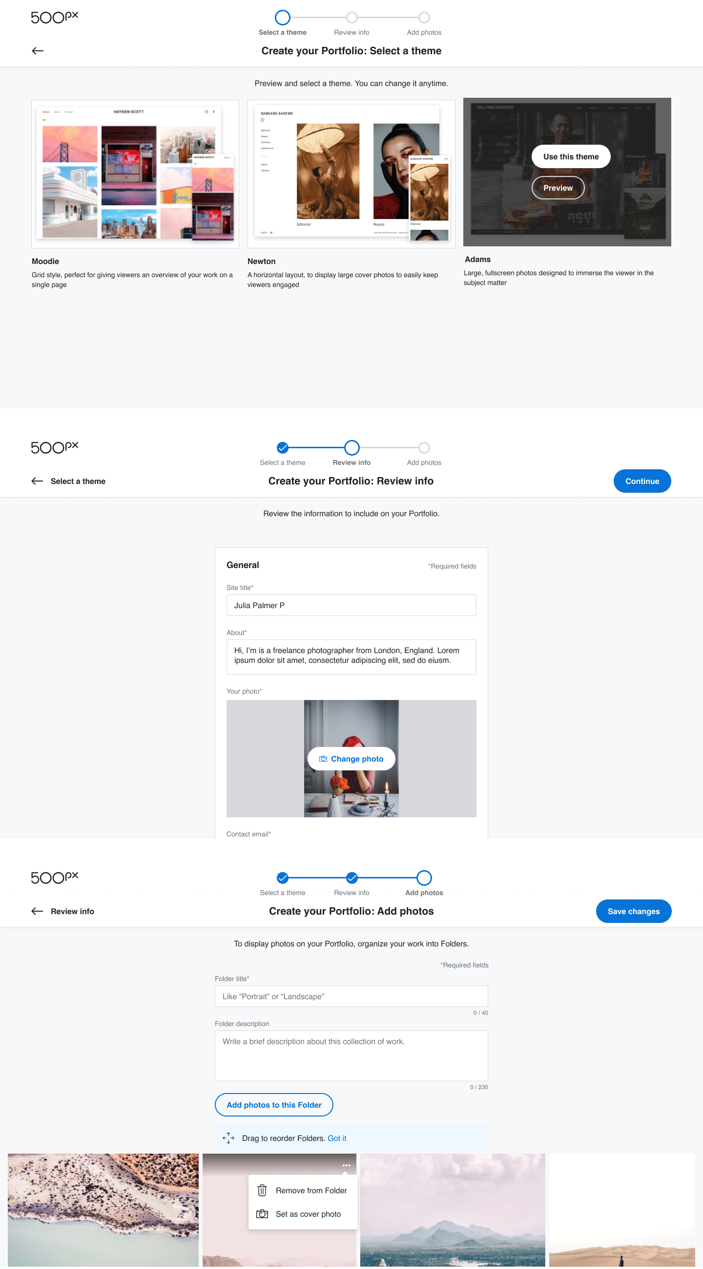
3-Step onboarding: Theme, Info, Add Photos.
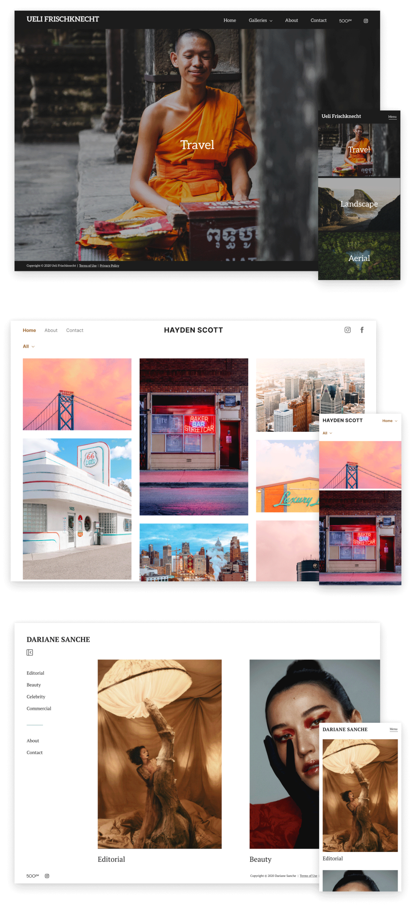
We wanted to validate this new feature quickly, but we knew from our conversations with photographers that we couldn’t just roll out a one-size-fits-all solution. To keep things manageable while allowing for customization, we settled on launching with 3 themes. Each theme was made available in light or dark mode, with control over the typeface and primary colour used. With just those 3 variables, 126 different looks can be created*.
*Quick Math: 3 themes * 2 modes (light/dark) * 3 fonts * 7 colours = 126 variations
To keep the onboarding flow simple, we limited the initial customization to choosing a theme. After that it's just a matter of adding photos and some basic information, and the portfolio is ready to publish! All the other customization details including custom URL's is made available after the portfolio is published.
As with every project, we went with a mobile-first design philosophy. Building mobile-first is a great way to simplify your solution by enforcing space constraints. From there, it’s much easier to scale an idea up than it is to try cramming a desktop layout down to a mobile one.
Results
We launched Portfolios without any of the usual price discounts on Pro memberships to see if the value finally matched the usual price point.
After the first month, we saw a 61% increase in Pro membership sales. Since it wasn’t being sold at a discounted rate, this resulted in a 102% increase in monthly Pro revenue.
In addition, the customer feedback was incredibly positive. We made a few small tweaks and fixes based on feedback, but the overall launch was solid thanks to all of our pre-launch internal testing.
The launch was by all accounts a huge success. Major credit goes to the lead designer on this project, Hyunjin Min, who I both hired and collaborated with.
To learn more or build own Portfolio, head over to 500px.com/portfolio.